The LinguisDam Good Fish - More Than a Marketplace
Engineering a digital home for fresh fish lovers, one that sells, engages, and grows.
I collaborated directly with the founder of a regional fish delivery startup that had already built a cult following of 1,00,000+ loyal customers. Their offering was unlike typical grocery or seafood platforms, the fish were bred sustainably in chemical-free freshwater dams, cut only after an order was placed, and delivered with a promise of freshness and hygiene.
Their brand stood for quality, sustainability, and community ,but their tech experience didn’t match that promise yet.

1. The Business Challenge
 The website was hard to use for new customers
- The website was hard to scale for new user segments
- Community-building efforts (like recipes, loyalty rewards) had no dedicated space
- Customer growth had plateaued due to limited engagement touchpoints
2. Surveyed 1000+ Consumers
To validate business assumptions and understand user needs, we conducted a survey with 1,000+ regular fish consumers, people who eat fish at least once or twice a week.
Our goal: identify behavior patterns, frustrations, and wishlist features that could shape a seamless digital fish-buying experience.
![]() Where People Buy Fish Today?
Where People Buy Fish Today?
- Majority still buy from local markets, citing freshness and familiarity
- Supermarkets and online apps are used by fewer users, often with hesitation
- There is strong offline loyalty, but also openness to digital solutions that feel trustworthy
![]() Key Frustrations (Offline & Online)
Key Frustrations (Offline & Online)
- Majority still buy from local markets, citing freshness and familiarity
- Supermarkets and online apps are used by fewer users, often with hesitation
- There is strong offline loyalty, but also openness to digital solutions that feel trustworthy
“I want to know exactly what I’m paying for, and that it’s fresh.”
![]() What Users Expect in a Fish Delivery App
What Users Expect in a Fish Delivery App
 Detailed product info (fish type, source, weight, cut style)
- Real-time freshness indicators
- Filter options for cleaning, cutting, taste profile
- Recipe recommendations + usage tips
- Loyalty rewards & first-order discounts
![]() Browsing Preferences
Browsing Preferences
- Most prefer to browse by fish category (freshwater, shellfish, etc.)
- Users value clarity over visual clutter — want fast decisions, not exploration
- Trust grows when visuals match real product quality
![]() Ordering Frequency
Ordering Frequency
- 60%+ of users buy fish once a week or more
- This creates potential for weekly-order flows, subscriptions, or reminder nudges
3. Aligning Business Goals with User Needs
Translating brand values and user insights into real product features. After gathering insights from 1,000+ users, we mapped them against the brand’s core mission and growth vision to design a product experience that’s not only functional — but distinctly TRP.
![]() Brand Pillars We Designed Around
Brand Pillars We Designed Around
TRP’s identity is built around trust, freshness, and transparency — and every design decision reflected that.
- Fresh, Chemical-Free Fish: Sourced from clean freshwater dams, with no antibiotics or additives.
- Cut-to-Order Model: Fish is prepared only after the order is placed — guaranteeing peak freshness.
- Specialized Packaging: Freshness is preserved with custom-insulated boxes designed for hygiene and temperature control.
![]() Strategic Feature Mapping
Strategic Feature Mapping
We identified opportunities where user expectations and business objectives aligned — and built features that respected both.
- Web-to-App Transition ~ Gently migrated loyal users with prompts and incentives.
- Smart Categorization ~ Made browsing easier with filters by type, cut, and taste.
- Loyalty Tools ~ Boosted retention through coupons, bulk discounts, and memberships.
- Transparent Listings ~ Showcased sourcing, nutrition, and freshness with every product.
- Fast Checkout ~ Reduced friction with simplified payments and slot flexibility.
- Cooking Forum ~ Enabled community sharing with recipes, tips, and a reward system.
- Live Tracking ~ Kept users informed with real-time delivery updates and controls.
- Education Hub ~ Built trust through articles on seafood safety, prep, and benefits.
Each feature was mapped to a real user need and a business priority: Users wanted clarity, freshness, and control. The business needed scalability, engagement, and brand recall We bridged that gap through thoughtful experience design ~ not just functionality.
4. Key Screens Showcase
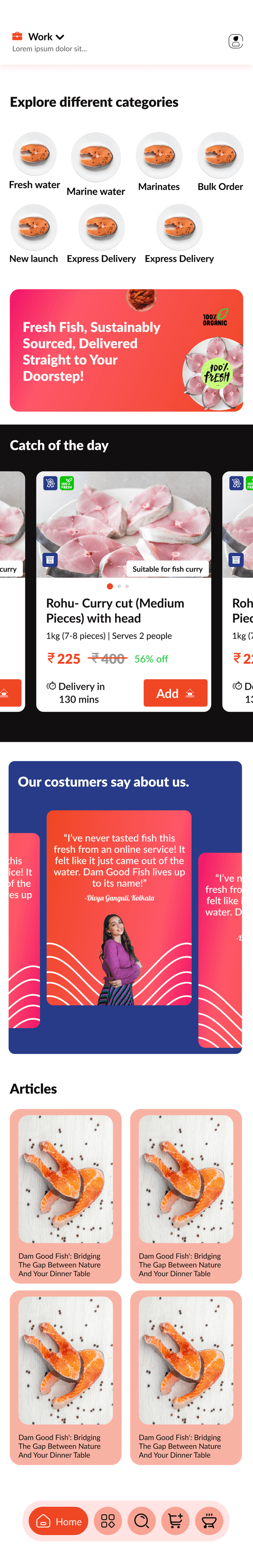
Home Screen Overview
The home screen is designed to build trust, reduce effort, and reflect TRP’s brand promise of fresh, chemical-free fish.
- Smart Categories for fast access to Freshwater, Marine, Marinates, and Bulk Order
- Brand Banner reinforcing cut-to-order freshness and sustainable sourcing
- Catch of the Day section with timed deals, discounts, and freshness cues
- Testimonials to build credibility through real user voices
- Articles for educating customers and boosting engagement
- Bottom Navigation optimized for thumb-reach and key actions
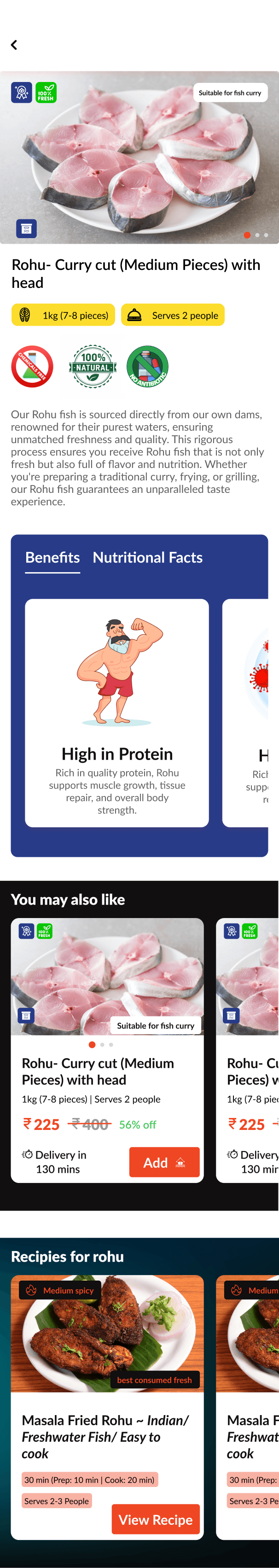
Product Detail Page: Rohu Curry Cut
Designed to build immediate trust and provide full clarity before purchase.
- Visual freshness badges for chemical-free, antibiotic-free fish
- Clear portion info (7–8 pieces, serves 2) with prep guidance
- Catch of the Day section with timed deals, discounts, and freshness cues
- Testimonials to build credibility through real user voices
- Articles for educating customers and boosting engagement
- Bottom Navigation optimized for thumb-reach and key actions
“Is this the right product for me — and can I trust it?”
And making sure the answer was always: yes.
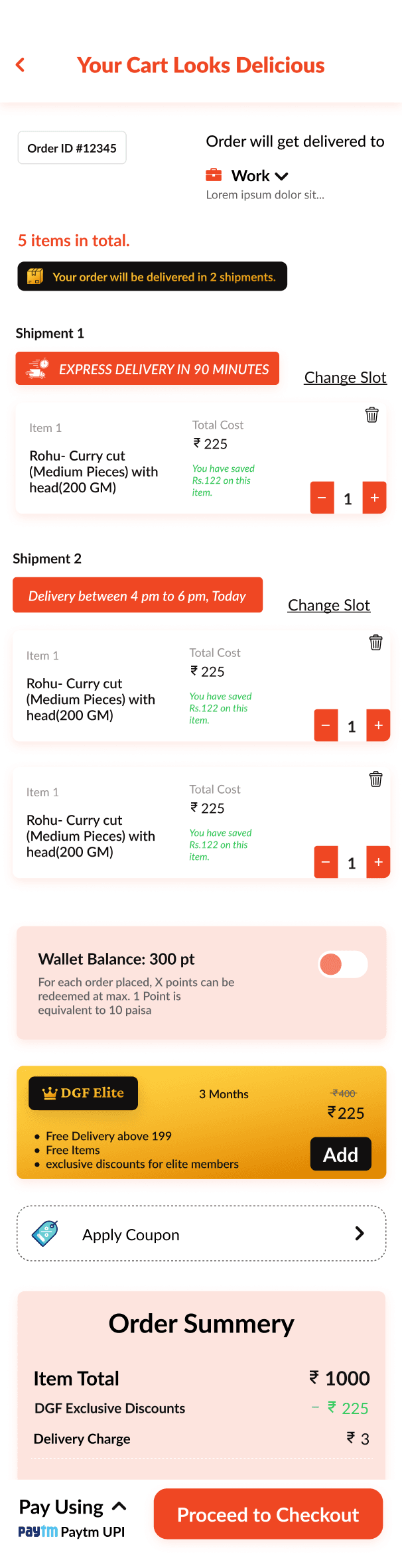
Checkout
Designed to build immediate trust and provide full clarity before purchase.
- Split Shipment View with editable time slots
- Express Delivery Option clearly marked for urgency
- Change Slot option gives users control over timing
- Smart Merge Logic (not shown here): users can combine multiple deliveries into one if preferred
- Wallet Toggle + Coupons + Membership to apply benefits without distraction
- Clear pricing, discounts, and savings at a glance — no hidden costs
Outcome: A checkout experience built for trust, speed, and smart decision-making — without overwhelming the user.
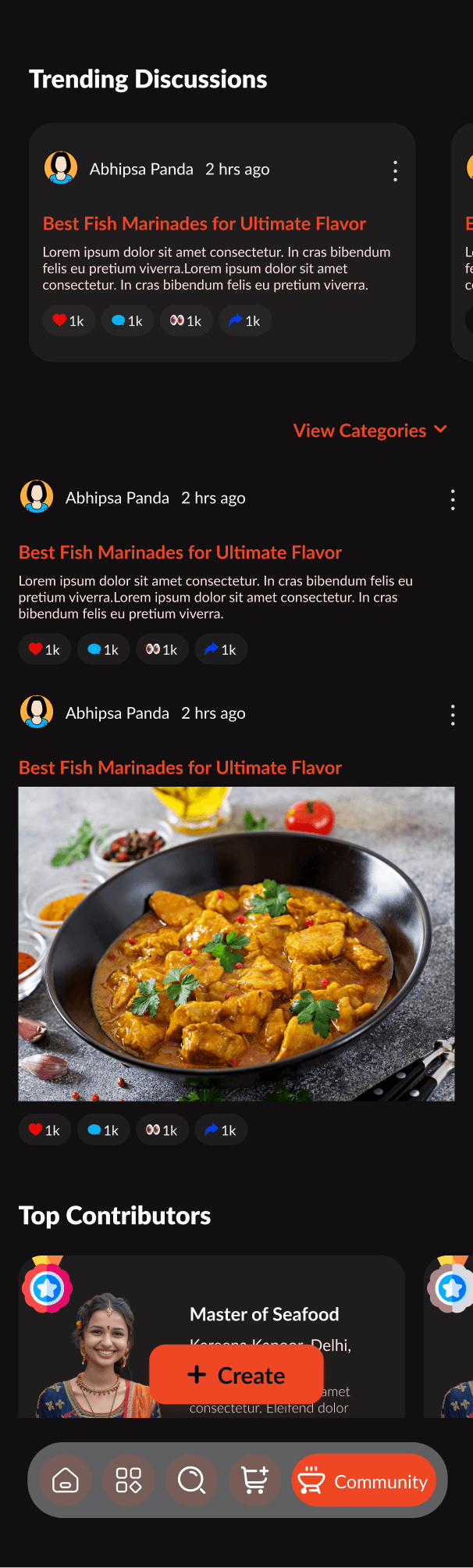
Community Forum
Designed to build immediate trust and provide full clarity before purchase.
- Trending Discussions featuring top-rated posts, updated in real time
- User-Generated Recipes with interaction tools (likes, saves, shares)
- Top Contributors section with badges to highlight loyal community voices
- “Create” Button for seamless content posting
- Rich content support (images, text, reactions) for visual storytelling
- Clear pricing, discounts, and savings at a glance — no hidden costs
Builds trust by showcasing real experiences Encourages participation through gamified rewards. Makes the brand feel more like a community than a store